


Colour is one of the most powerful design tools available, how we choose to introduce colour around the home can have a profound impact on the mood and atmosphere within a space. In this feature of Curated, we are showcasing a stunning property located in Co.Dublin and designed by Gary Cohn, Head Designer at COHN. Journey with us as we travel through this property from room to room, exploring the power of colour throughout this home.
The Living Room

Colours: Hard Frost (Wall Unit), Brushed Gold (Main Walls) and Obscure (TV Unit)
The use of colour in this living room is both bold and invigorating, creating an energetic yet cosy feel that is ideal for welcoming and entertaining visitors in this home. The striking contrast of Brushed Gold against the rich and alluring Obscure creates a key focal point and naturally draws the eye towards this corner of the room. These colours have a luxurious feel to them, making for the perfect colour combination to enhance the feeling of sophisticated comfort in this space.

Colour: Brushed Gold
Taking a closer look at Brushed Gold in this reading nook, the overall appearance is one of timeless opulence. The toasted, golden hue of Brushed Gold will add an undeniable sense of warmth to any space. Discussing the inherent warmth of this shade, designer Gary Cohn describes how “when the sunlight hits this shade, the light reflects and it feels as if you are in front of a warm, toasty fire”. Brushed Gold will work beautifully on walls to create a comforting, cosy feeling or as a statement colour that will command attention in a room.
The Dining Room

Colour: Lemon Drizzle Cake
Moving from the living room of this property into the dining room, the atmosphere shifts from cosy and cocooning to calm and refreshing with the help of Lemon Drizzle Cake. As delicate as the soft sponge of a freshly baked lemon drizzle cake, this delicious shade ensures this dining space feels light and airy. Once again, we see the use of rich woods continued in this space, creating a flow from room to room as we journey through this home.
The Study

Colour: Obscure
In contrast to the previous rooms explored, the ambience in this study is moody and intriguing. The deep, navy blue hue of Obscure paired with the antique pieces in this space gives this room an enchanting, old-world feeling. Echoing design elements similar to those featured in the living room of this property, the luxurious colour combination of rich blues and toasty golds is once again seen in this space.

Colour: Obscure
Bold blues like Obscure work beautifully in low-lit or north-facing rooms to enhance the feeling of depth in a space. Rather than fighting with the natural light or attempting to create an illusion of light, embracing the lower light with rich, moody colours can be a great way to create a cocooning feeling in any room of the home.
The Hall, Stairs and Landing

Colour: Motte & Bailey
Connecting the upstairs and downstairs of this property is this stunning Motte & Bailey colour-drenched hall, stairs and landing. Colour drenching is a trending design technique in which the same colour is used across multiple surfaces in a space- for example, the walls and woodwork in this hallway, creating a very cohesive and unified look. Depending on the colour chosen, colour drenching can be bold and vibrant or more calm and subdued, the latter of which describes the effect of Motte & Bailey here. Creating the perfect link between the lively downstairs area of this property and the more calm, serene upstairs, Motte & Bailey gives this landing a down-to-earth, grounded feeling.
The Bedroom

Colour: Hard Frost
An oasis of calm, Hard Frost creates a soothing, tranquil feel in this bedroom. Rather than competing with the feature wallpaper in this room, Hard Frost sits back and allows this fabulous paper to remain the main focus within this space. Crisp and refreshing in nature, this pale and moody grey creates a bright and airy look. A fresh hue like Hard Frost will illuminate the walls in any interior setting, beautifully reflecting the light around a room to enhance the feeling of space. Hard Frost is a fantastic alternative for a crisp white, creating a fresh look without the starkness of a pure white.
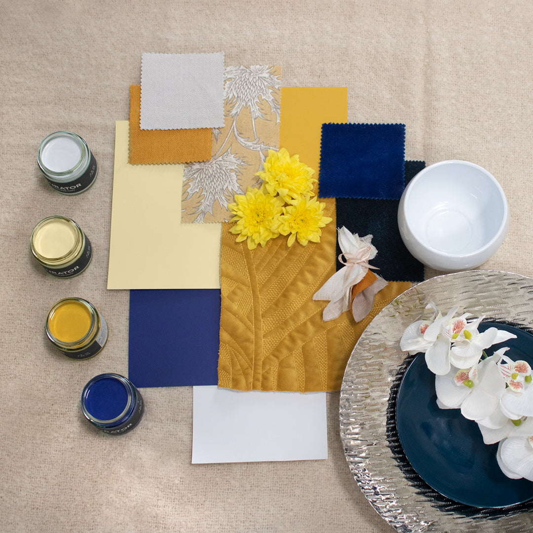
The Colour Scheme

Colours: Hard Frost, Lemon Drizzle Cake, Brushed Gold and Obscure
Journeying from room to room throughout this property, one can get a sense of the power of colour within this home in evoking a specific mood and atmosphere. Thoughtfully designed and curated by Gary Cohn of COHN Design, each room flows beautifully into the other. If you are interested in finding out more about Gary’s work, head over to the COHN Design website here or visit @cohn_design on Instagram here.
With 144 stunning colours and 5 luxurious finishes to choose from, the Curator palette has a scheme for every design, project and purpose. For further support and resources, visit our professionals page, or get in touch with us via the live chat feature on our website or via email at hello@curatorpaints.com. Our customer experience team are on hand to help with any of your colour or product queries you may have.